Earth Day Called, They Want Their Symbol Back
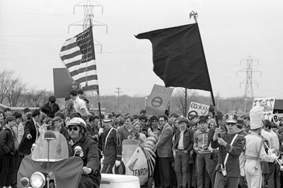
The University of Wisconsin Green Bay has a neat photo gallery of “Earth Day Memories” which includes campus images from the first Earth Day events in 1970. One thing that immediately grabbed my eye was that logo/symbol graphic… that vaguely e-looking symbol which I remember, but suddenly realize I’ve haven’t seen in a very long time. Apparently, it’s enjoying a quiet retirement with Smiley Face.
You can see it on some of the signs in the crowd:
And here, on the stage backdrop:
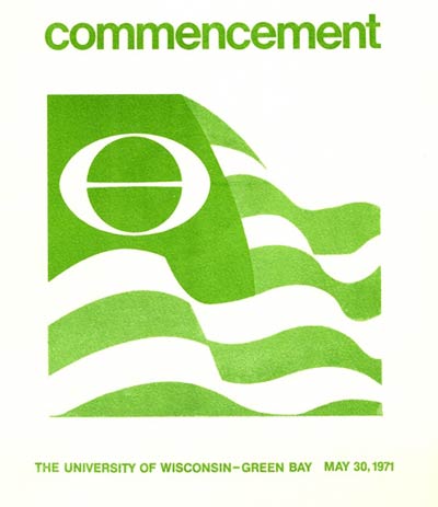
And check out this cover from the 1971 commencement program:
The website www.art-for-a-change.com declares that it’s time to breathe new life into this iconic ecology symbol, and the site also clears up the mystery behind the icon’s history:
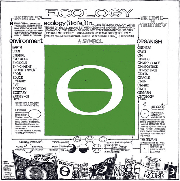
The Ecology symbol was created by artist Ron Cobb, and the icon gained in popularity before the founding of Earth Day. Cobb’s symbol, first published in 1969, combined the letter “E” (for earth and environment), with the letter “O” (representing wholeness and unity). The symbol became wildly popular and found its way onto flyers, posters, buttons, banners, patches and bumperstickers. Flags of the World, the organization dedicated to the scholarly study of flags, credits Ron Cobb for the Ecology Flag, a green version of the U.S. flag that features Cobb’s famous symbol as its emblem.
Ron Cobb’s official website includes a vintage 1969 visual look into the creative thinking behind the visual. Don’t miss the shocking (in 1969, anyway…) sexual revolution references!
So it’s up to us. Do we want thousands more little green sprouts and hands-cradling-earth images, or do we want a symbol that we can put on a placard and march to? In 2010, it’s e for me.


Cool post. Thanks!
Great post… I was at the first earth day in ann arbor at chrysler arena in 1970. I started looking for THE symbol and finally found it on your site, thank you!
i am disappointed with our progress over the past 40 years, but i do look to the future…
thanks, j
I have one of the first ecology flags, described below. I have owned it since 1979 and I am now interested in selling it to a museum. Can you tell me how I would go about doing this?
This flag is one of a number of “ecology flags” developed in the United States in the late 1960s and early 1970s. The first such flag was simply the Stars and Stripes with its blue replaced by dark green and its red by light green. That design, made by the Paramount Flag Company of San Francisco in August 1967, flew at the famous People’s Park incident at the University of California in Berkeley. The colors symbolized “the pure air and green land tha was America once and that can be ours again if we take the action necessary to recover our heritage.”
Very cool, and love the history! If it were me, I’d hold onto it; I don’t know off my head of an appropriate new “home” but who knows, maybe it will find you eventually! Dale, thanks for sharing.
I also have one of the “rare” green and white ” flags.My wife to be bought it for me instead of the flag with the “e” .As a matter of interest,once down in South Carolina ,on a camping trip,Iflew this flag at my site,and it drew alot of comments ,back in the earky 1970’s.I would not get rid of it for anything,hold on to it.
What a load. He drew a picture of the Earth with an equator, flattened it (probably as a result of a drug induced bleary-eyedness causing him to hold his head down low near the table and thereby see his circular drawing as an elipse) and published it. When it took off he produced a storyline to make it sound like genius.
Give me a break.