Earth Day Called, They Want Their Symbol Back
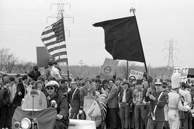
The University of Wisconsin Green Bay has a neat photo gallery of “Earth Day Memories” which includes campus images from the first Earth Day events in 1970. One thing that immediately grabbed my eye was that logo/symbol graphic… that vaguely e-looking symbol which I remember, but suddenly realize I’ve haven’t seen in a very long time. Apparently, it’s enjoying a quiet retirement with Smiley Face.
You can see it on some of the signs in the crowd:
And here, on the stage backdrop:
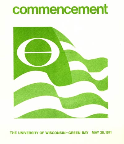
And check out this cover from the 1971 commencement program:
The website www.art-for-a-change.com declares that it’s time to breathe new life into this iconic ecology symbol, and the site also clears up the mystery behind the icon’s history:
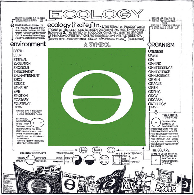
The Ecology symbol was created by artist Ron Cobb, and the icon gained in popularity before the founding of Earth Day. Cobb’s symbol, first published in 1969, combined the letter “E” (for earth and environment), with the letter “O” (representing wholeness and unity). The symbol became wildly popular and found its way onto flyers, posters, buttons, banners, patches and bumperstickers. Flags of the World, the organization dedicated to the scholarly study of flags, credits Ron Cobb for the Ecology Flag, a green version of the U.S. flag that features Cobb’s famous symbol as its emblem.
Ron Cobb’s official website includes a vintage 1969 visual look into the creative thinking behind the visual. Don’t miss the shocking (in 1969, anyway…) sexual revolution references!
So it’s up to us. Do we want thousands more little green sprouts and hands-cradling-earth images, or do we want a symbol that we can put on a placard and march to? In 2010, it’s e for me.


