Artfrastructure! Cover My World

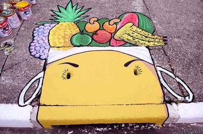
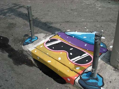
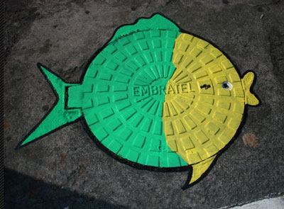
São Paulo, Brazil artists Anderson Augusto (aka SÃO) and Leonardo Delafuente (aka Delafuente) are taking it to the streets with the “6emeia Project” with the goal to change and transform some of the more mundane objects in the urban landscape.

From the 6emeia website (where you can see many more examples):

The duo’s objective is to modify the means within which we all live, proposing a new way to view things by reflecting upon themes generated through creative and unusual works. Such modifications are made by painting storm drains, light posts, manhole covers and any other object which makes up the urban scenario.

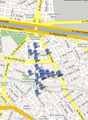
And should you be in the neighborhood and want to experience any of these works first-hand, check out the map with specific locations. Lots to see! Sounds like a day trip that could be rather draining!

Chihuly Loves Water, We Love Chihuly

There’s something about Dale Chihuly’s celebrated work that leaves a lasting impression on many people, even those who don’t normally feel a connection with contemporary “art.”  Could it be something in the water? Chihuly states,

“I love to be around water. There is no doubt in my mind that water is conducive to thought. Water allows me to be incredibly creative. The connections between glass and water are so unbelievable and so visual.”

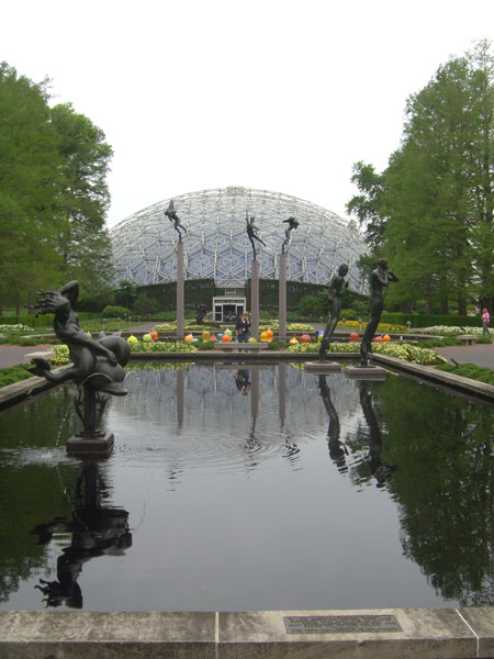
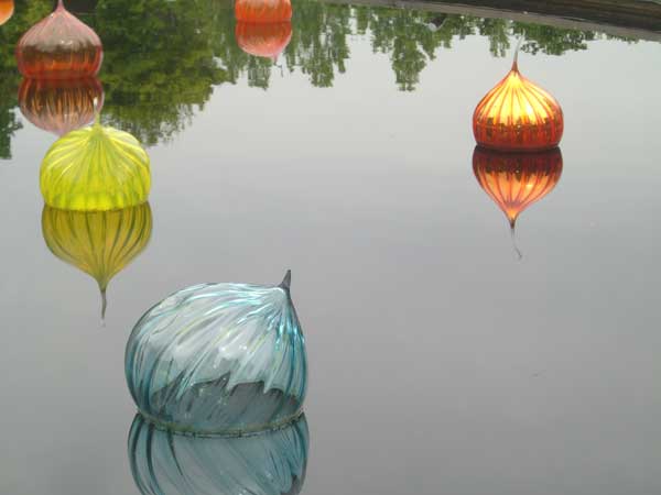
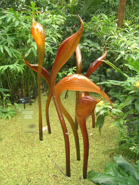
Thirsty in Suburbia intern Virginia Leonard took these photos on a visit to the Missouri Botanical Garden in Saint Louis this summer. For part of 2006, Chihuly’s “Glass in the Garden” installation here featured stunning  sculptures placed throughout the garden. Following that, several pieces (including Walla Walla and Sunset Herons, shown here) were purchased to remain at the gardens permanently where they continued to leave an lasting impression on visitors.

For more inspiration, see the the phenomenal water gallery at chihuly.com.

Missouri Botanical Garden: The Reflecting Pools and The Climatron (1960) the world's first geodesic dome greenhouse.

"Walla Walla" installation

"Walla Walla", closer: fantastic interplay of shape, light and color.

"Sunset Herons" are displayed inside the Climatron.

"Sunset Herons" are displayed inside the Climatron.

Up is Down is Around: Water Ambigram

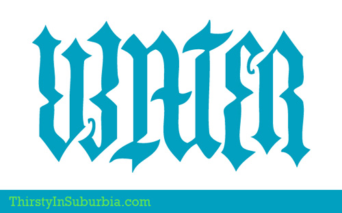
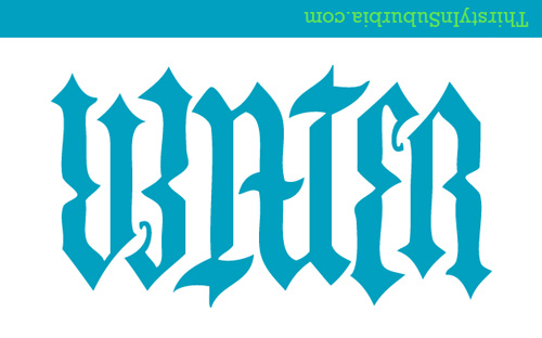
What’s an ambigram? It is a typographical design that may be read as the same word or phrase (or sometimes two different words or phrases) when rotated or reflected.

This Water ambigram (and ambigrams in general) have surged in popularity recently after playing a prominent role in the plot-line of Dan Brown’s bestselling novel Angels & Demons. The book contains a number of ambigrams created by real-life typographer John Langdon including representations of the four elements of Earth, Air, Fire and Water. (These were shown only briefly in the movie.)

If you’re thinking you’ve finally found your ideal tattoo design, you might reconsider. I won’t say what happens to the four Cardinals in the book who end up “branded” with these design elements. Let’s just say they all died by “natural” causes. (See and read more at ambigram.com)

Here’s the Water ambigram two ways, untouched except for its 180-degree rotation.


Can you Spare a Square for Art?

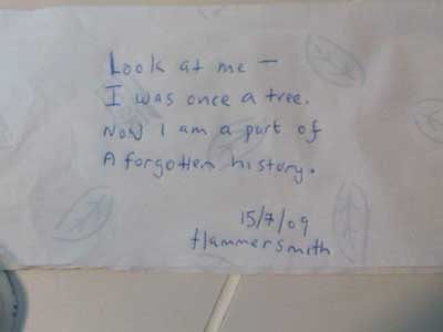
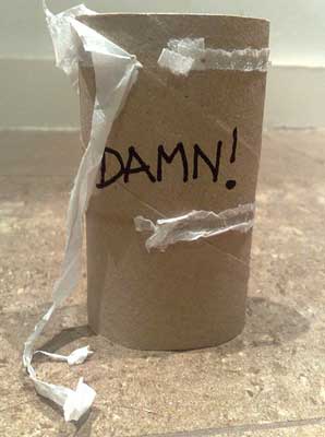
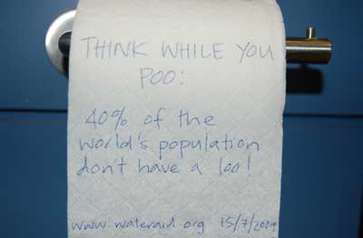
If only I had the time to sit down, think and reflect, share my thoughts with others…wait, perhaps I “doo!”

Artinloo is a collaborative photo project where people express what’s on their minds while alone in the loo. Why the restroom? As the site explains,

Because it is one of the few places in the world where people are almost unproductive and really alone with themselves!

If you’re unwilling to stand for the sake of art, here are the guidelines for making a submission:

1. Once alone in the loo, express on a piece of toilet paper what you are thinking about at that moment. 2. Be as original/sensible/artistic/humoristic as possible when you personalize your piece of toilet paper. The goal is to break the taboo surrounding this room and to evoke emotion and create discussion. 3. Once finished, take a photo of your creation and email it at artinloo@gmail.com.

Some inspiration to get you started:

A Moving Tribute from Brazil

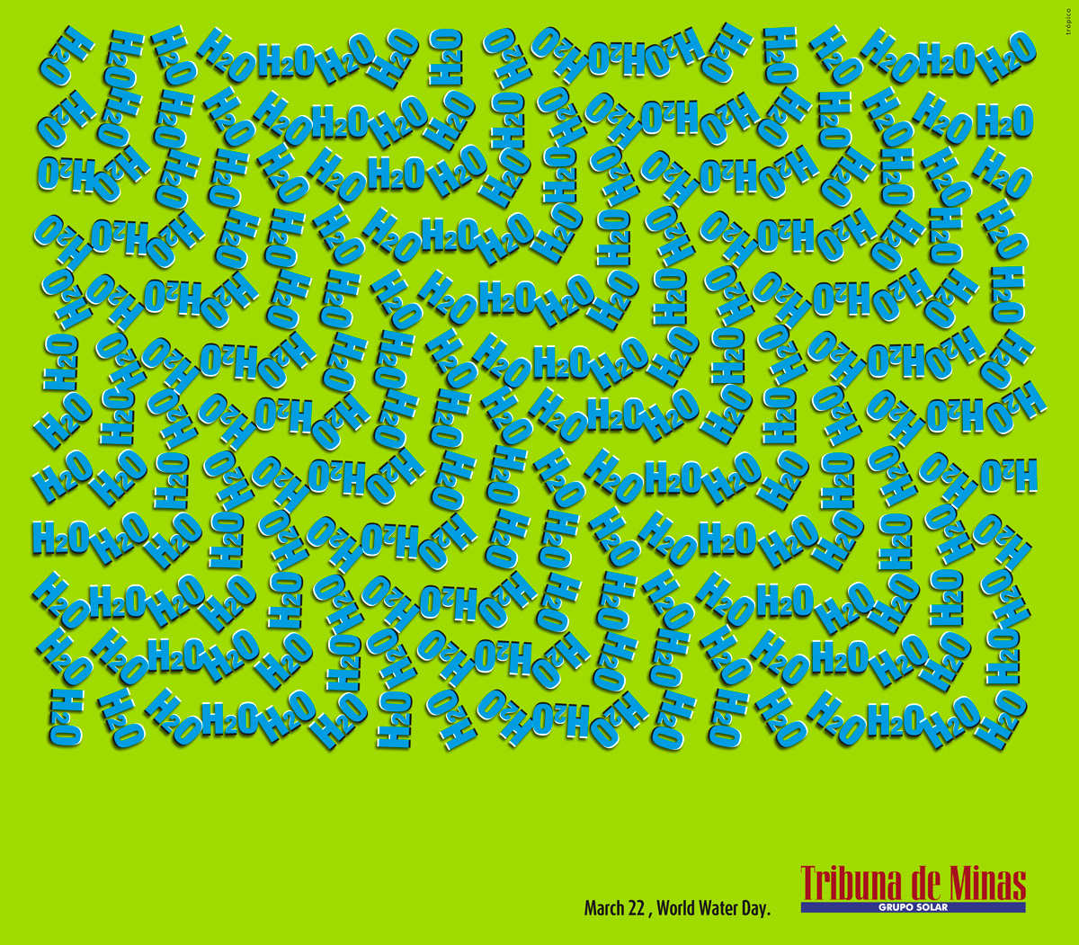
Here’s an advert from March 2009 spotlighting World Water Day that likely to make you feel seasick! From Tribuna de Minas, a newspaper in Juiz de Fora, Brazil by ad agency Trópico Propaganda. (Click to view it full size for maximum headaches or tipsiness!)

Novelty aside, there’s actually something to be learned from these types of visual illusions. This article from the May 2008 Scientific American, The Neuroscience of Illusion, discusses the scientific value of visual illusions and shows how tricking the eye can reveal the inner workings of the brain.

Imagine a Water Factory

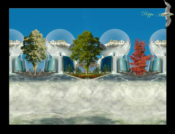
In the future, we won’t worry about water scarcity because by then, our advanced technology will enable us to manufacture it! Farfetched, yes, but this fantastically surreal piece by Como, Italy artist Giuseppe Marcesa, “Water Factory” should remind us to tame our technology-to-the-rescue mentality.

I asked him what he was thinking about in creating this piece; he says, “I just was thinking about foolish people thinking to solve problems when it is too late. Another example is cancer, instead to think about the way to avoid it, we spend money and time to research to solve it when we got it!!!”

Well said, and well imagined, too.

Lost in the Plastic Forest

The recent Figment 2009 event, held June 12-14 at Governors Island in New York, is described as “a FREE, annual celebration of participatory art and culture where everything is possible.”

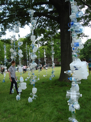
One possiblity realized was “Watershed” an eco-installation from MSLK that ties together, literally, the many senseless aspects of bottled water consumption in the West. From the Figment 2009 website,

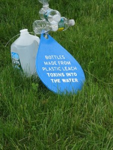
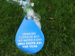
“Watershed” is a man-made forest of 1,500 plastic water bottles collected from the New York City area, which serves as a visual representation of one second of U.S. consumption. Out of the 50 billion bottles of water consumed each year, 80% of these bottles are currently not being recycled. Bottled water is 1,900 times more expensive than tap water, and the toxins emitted by it have been linked to serious health problems, such as reproductive issues and cancers. “Watershed” was created with the hope that viewers will shed the notion that they need to buy water in plastic bottles. If we are looking to better the environment, water is a great place to start, since we have the best quality water coming out of our taps.

 
Photos by Katie Killary on Flickr

If you’re wondering who threaded and hung all those bottles, MSLK’s website features a prequel to the main event with a video that documents the nuts and bolts of building “Watershed.”   

Watershed Assembly at MSLK 5/24/09 from MSLK on Vimeo.

The Campaign for Lovely Carafes

Thankfully, many great campaigns are underway to get clean water to those who desperately need it.

But what about getting water to those who need it in a chic, well-designed container? Isn’t design-lifestyle snobbery one of the factors that’s spurred the rise of premium bottled waters?

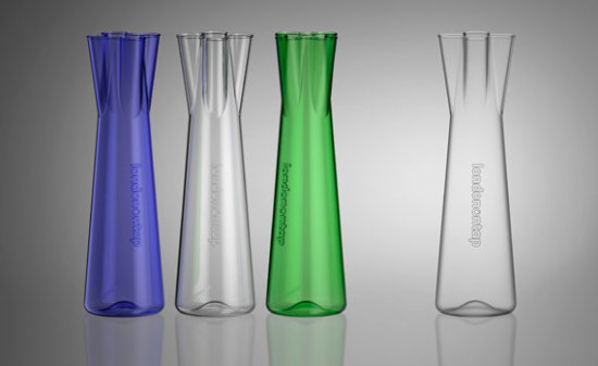
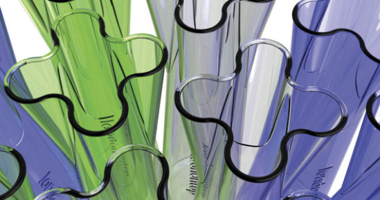
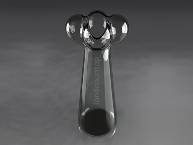
Perhaps a good strategy is to “fight fire with fire.” The 2008 London On Tap competition teamed London’s mayor with Thames Water to draw designers into the tap water vs. bottled water struggle via a contest to create the ultimate water carafe. The winning design, “Tap Top,” (created by Islington industrial designer Neil Barron) went on sale last week for £10. (£1 of each sale will be donated to the charity WaterAid.) The goal is to get every London restaurant to serve tap water in this beautiful, chic carafe.

To kick the campaign off, at least 1,000 restaurants are receiving a carafe; the campaign hopes to ride the coat-tails of a previously successful campaign that convinced thousands of restaurants and bars to actively offer free tap water. (Did you notice that the Tap Top’s top mimics the shape of a old-school tap handle?)

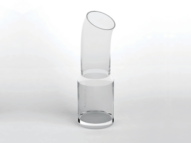
Tap Top edged out some truly worthy entires, including these two shortlisted designs:

“Connected Pipe” by East End designer Nina Tolstrup

“Tap” by Adam White of London’s Factory Design Ltd.

Art to Go: Creative Toilets and Urinals

From Now That’s Nifty, a blog that earns it’s name with their post of Unique and Strange Toilets and Urinals. Check out the post to see them all, but here are a few that will leverage robust, innovative solutions for “doing your business.”

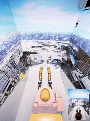
Here, you can go with vertigo! The trompe l’oeil mural at this Japanese ski resort toilet leaves you on the edge of your seat!

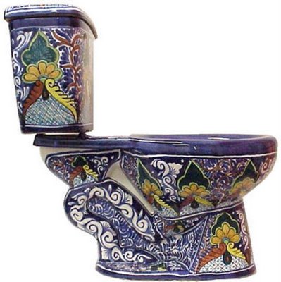
There will always be a market for creations such as this lime-colored art loo. Because, recession or not, there will always be affluent people who simply MUST have something different. (This is not a pipe.)

If I owned this breathtaking object, just like guest towels and good china, I would forbid anyone but “company” from using it.

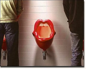
Here is a “mouth” urinal. Worth nothing: due to gender preferences, I assume, there are no coordinating “mouth” toilets.

Most Dangerous Species in the Mediterranean

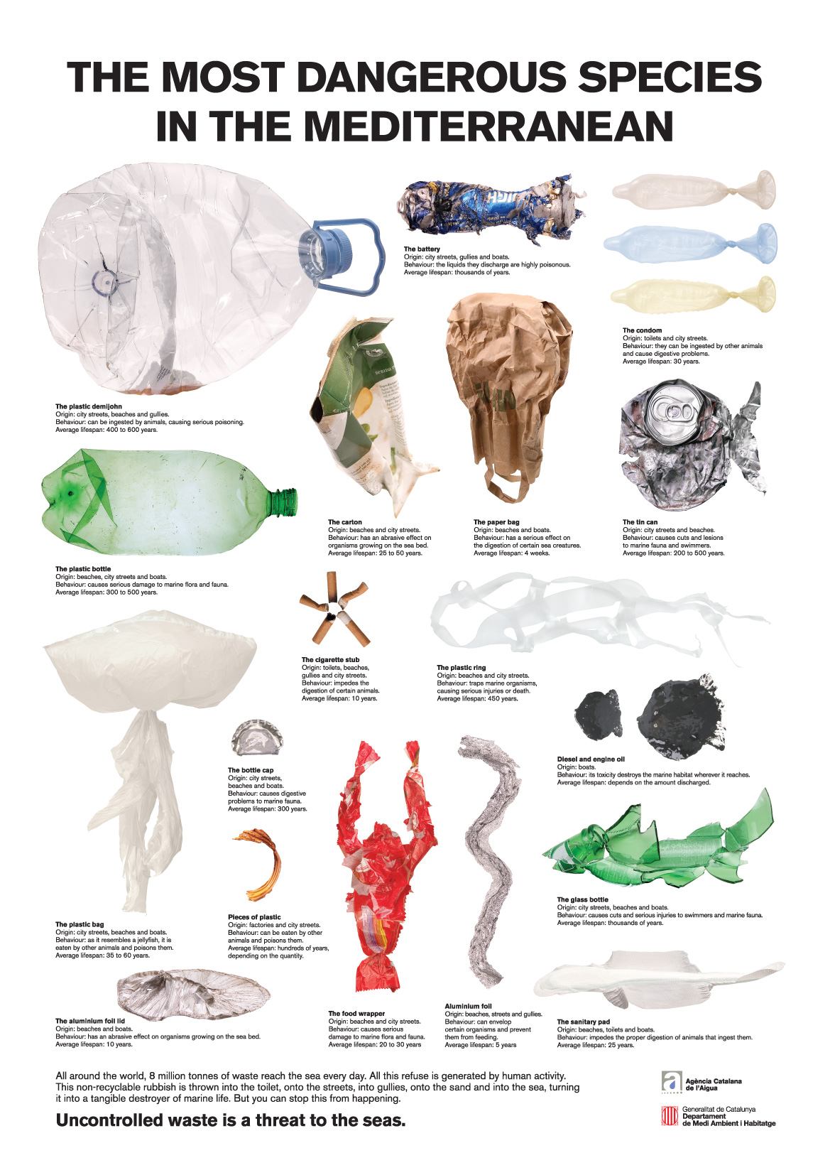
A public service campaign that will delight you into doing the right thing. From the website of Klas Ernflo (cool name!) it is a “Campaign for the Government of Catalunya to keep the Mediterranean sea clean.”

Look closer and read the text in this larger version.

(I saw this on Presurfer, who saw it on Dark Roasted Blend. Thanks for sharing!)